Loading...
0%
Loading...
0%

Share
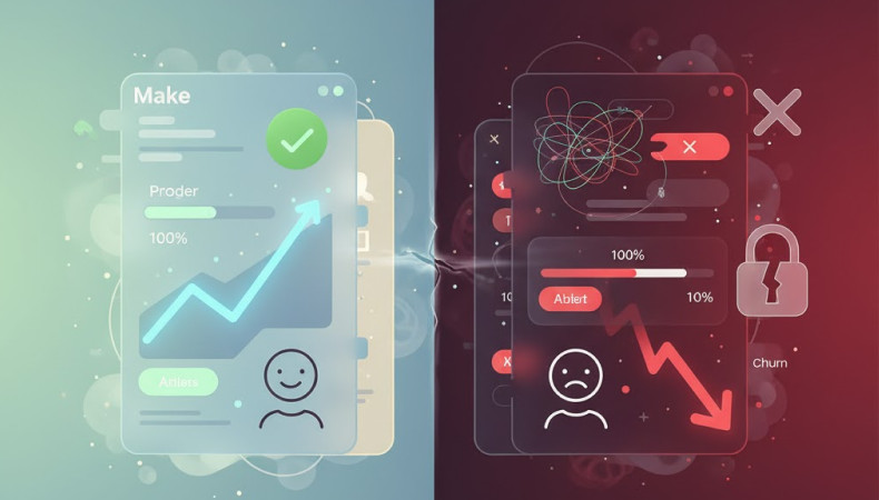
Your SaaS product might be packed with features, but none of that matters if users can’t figure out how to use it. Usability is often the deciding factor between a loyal customer and a churned user. Poor UX silently bleeds growth, kills engagement, and makes your competition look better than they are.
In this blog, we’ll uncover the most common UX mistakes SaaS companies make, the consequences of those mistakes, and how to fix them effectively.
Most SaaS products suffer from feature bloat. Founders want to show value fast, so they pile on features. The result? Confused users who bounce before they understand the core value.
Symptoms:
Overwhelming dashboard
Long menus with unclear labels
Too many configuration options on first login
Fix:
Focus on ONE core value proposition.
Introduce features gradually using progressive disclosure.
Use a simple, contextual onboarding experience.
Example: Notion begins with a single clean page. Only as users interact do advanced options appear, avoiding overwhelm.
SaaS success depends on how fast users find value. If onboarding is clunky, confusing, or boring, users churn before they even get started.
Fix:
Use tooltips, modals, or in-app tours to guide users.
Personalize onboarding based on use-case.
Highlight one quick win.
Example: Grammarly's onboarding shows value immediately: a live demo of real-time corrections. Users are hooked within minutes.
Tip: Don’t overexplain. Let users experience value through doing, not reading.
A disjointed design language breaks trust. When buttons, colors, or layouts change across screens, users feel lost or frustrated.
Fix:
Use a unified design system (like Material Design or custom Style Guide).
Maintain consistency in spacing, icons, labels, and CTAs.
Keep micro-interactions (like hover states, loaders) aligned.
Example: Figma maintains pixel-perfect consistency throughout its app—from desktop to plugin interface.
When users click a button and nothing happens, it creates uncertainty.
Symptoms:
No loading spinner during actions
No confirmation messages
Lack of success/failure states
Fix:
Use animations, tooltips, or loaders to acknowledge every action.
Provide clear error messages.
Example: Airtable shows a subtle "saving..." message and a green checkmark after autosave. This tiny signal builds trust.
Even B2B users are mobile now. SaaS tools that aren’t responsive lose opportunities every day.
Fix:
Implement responsive layouts and touch-friendly controls.
Test real use-cases on devices.
Streamline complex functions for smaller screens.
Example: ClickUp’s mobile app allows task management, notifications, and integrations on the go. It’s tailored for productivity, not just viewing.
Your user has decided to convert, but the final step feels like climbing Everest.
Symptoms:
Unclear pricing tiers
Too many form fields
Unnecessary account verifications
Fix:
Simplify plans. Highlight one recommended tier.
Use SSO or social login to speed up sign-up.
Break long forms into short steps with progress bars.
Example: Calendly reduces signup friction with Google sign-in and smart defaults.
You can’t fix what you don’t know. Without ongoing feedback, bad UX persists.
Fix:
Use micro surveys, NPS, and in-app feedback buttons.
Analyze session recordings for drop-off patterns.
Interview power users monthly.
Example: Intercom uses feedback from power users to continuously refine flows and interfaces.
Better UX = Better SaaS Most SaaS growth problems aren’t marketing issues—they’re UX issues. Every friction point adds up, and over time, users leave. Fixing UX mistakes can result in:
Higher activation rates
Increased retention
Lower churn
Greater customer satisfaction
At Reasonex, we specialize in designing and optimizing SaaS products that users love to use. From UX audits to full redesigns, we help SaaS startups build cleaner flows and happier journeys. Let's build your product the right way.

 +880 1750 261 977
 hello@reasonex.com
 +8801750261977
 +8801750261977
We design clear and modern digital products that people can use without confusion. Websites, dashboards, SaaS apps, mobile apps, brand guidelines, user flows, prototypes and no code websites. We make your product feel easy and professional.
Founders, startups, SaaS companies, and small businesses that need real results. Clients come to us because they are tired of messy design, slow teams, and unclear processes. They want a partner who takes responsibility and delivers.
Your timeline depends on the scope. But usually Landing pages take 3 to 5 Days. SaaS dashboards take 2 to 3 weeks. Full products take 5 to 8 weeks. If you give feedback quickly, we move fast. If you delay, your project slows down. Simple.
You get everything needed to launch. User flows Wireframes Final UI screens Clickable prototype Figma handoff for your developers Brand guidelines, if you choose branding Nothing half done. Nothing confusing.
You get 3 rounds per phase. Enough for clarity and polish. We guide you so you never feel lost, but we also keep the project on track.
Yes. We build high-converting no-code websites in Framer, Webflow, or WordPress. If you already have a development team, we give perfect handoff files so they can start coding immediately.
Pricing depends on the number of screens and complexity. We give a clear proposal after one call. No hidden fees. No confusion. Clients choose us because we save them time and reduce mistakes during development.
WhatsApp, Slack messages, Zoom calls, Figma links, Loom Recording, or any other way you like, you always know what is happening. You never feel ignored or lost.
Yes. Many clients come to us after failing with other designers. We fix confusing flows, update the UI, and make the product feel smoother. Most redesigns show immediate improvement in user experience.
Yes. Most of our clients are from the USA, Europe, the Middle East, and Asia. We handle time zones easily.
Yes. After the project is done, everything belongs to you. Figma files, assets, brand guides, components. All yours.
Yes. We explain everything clearly so your developers never get stuck. This saves you time, money, and stress.
Yes. Your idea stays private and protected from day one.
Yes. A design system keeps your brand consistent as you grow. It also saves development time and reduces future cost.
No problem. We update the scope and continue. You always know the cost and timeline before extra work begins.
Yes. You can hire us monthly for ongoing UI UX design, landing pages, and updates.
Because you want a team that treats your product like their own. We ask smart questions, fix unclear ideas, and make sure your design actually works for real users. Clients stay with us because we make the entire process simple and stress-free.
We do a short call to understand your goals. You get a clear proposal. If it feels right, we start. No pressure. No sales tricks. Just clarity.