Loading...
0%
Loading...
0%

Share
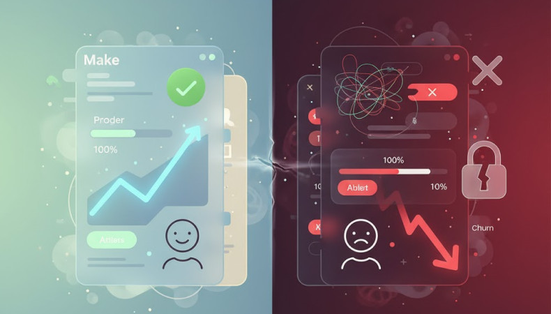
Most businesses assume slow sales mean a weak product. But often, the real problem is sitting right in front of you: your website design.
You can have the best offer in the world—if your site feels confusing, slow, or outdated, users leave before they ever experience it. UI (User Interface) and UX (User Experience) design are not “nice extras.” They are the silent engines driving your conversion rates.
This guide shows how strategic UI/UX design can dramatically increase your website conversions, backed by real examples and practical steps you can apply today.
Before diving in, let’s simplify the basics:
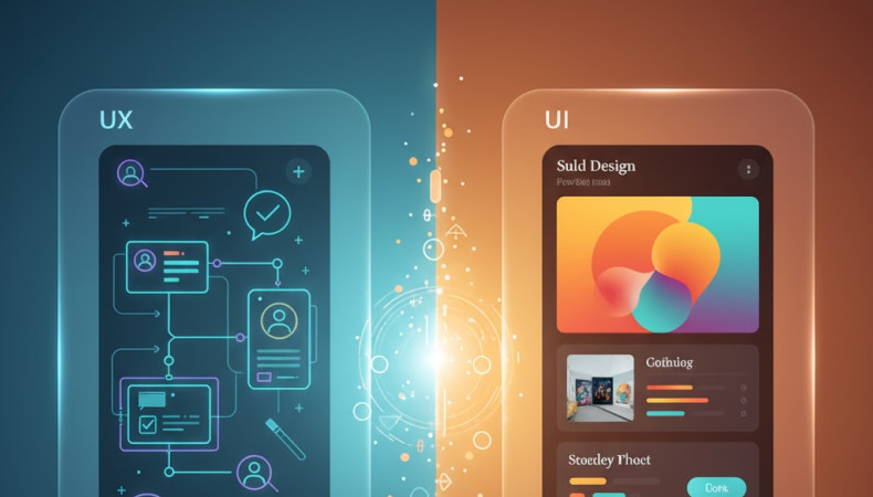
Think of UI as the face of your website—the colors, spacing, typography, layout, and visual clarity. UI determines whether users like your website the moment they land on it.
UX is the logic of your website—the journey, flow, usability, and ease of completing tasks. UX determines whether users stay long enough to convert.
UI grabs attention. UX converts that attention.
When both are strong, conversion rates rise. When even one is weak, the entire system collapses.
When a visitor lands on your website, they should instantly understand where to go and what to do. A cluttered layout is like a messy shop: people walk in, take one look, and walk out.
Apple’s homepage feels like entering a clean, well-lit store.
Simple categories. Stunning visuals. Zero friction.
Users move naturally from browsing → exploring → buying.
Simplify navigation. Use short labels. Use visible CTAs like:
Buy Now / Shop Now / Get Started / Learn More
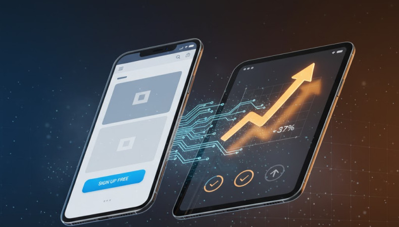
Every second saved increases conversion probability.
A slow website doesn’t just “feel annoying.”
It directly destroys money.
A 1-second delay can reduce conversion rates by up to 7%.
Amazon prioritizes speed relentlessly.
Even during Black Friday chaos, pages load fast and reliably.
That speed alone saves millions in potential abandoned carts.
Compress images, reduce scripts, and measure speed using Google PageSpeed Insights.
More than half of visitors browse from mobile, yet many sites still break on smaller screens.
Their app makes ordering coffee feel effortless—customization, store finder, payment—everything is built for thumbs, not mice.
Use responsive design.
Make tap targets large.
Ensure text is readable without zoom.
Every extra field, every extra click, every moment of confusion adds friction—friction that kills conversions.
Browse → Filter → Book.
No unnecessary questions. No confusing steps.
That smooth process is why people complete bookings instead of abandoning them.
Shorten forms.
Remove non-essential steps.
A/B test your checkout flow constantly.
People buy when they feel safe.
If your site looks outdated or unprofessional, trust drops instantly.
Simple visuals. Clear security signals. Consistent branding.
Users trust it because the design communicates safety before the copy even speaks.
Add trust badges, testimonials, SSL seals, real contact info, and consistent branding.
Personalization keeps users engaged longer, consuming more content or exploring more products.
Their personalized suggestions keep users hooked because the platform feels tailored to each person.
Use dynamic product recommendations, personalized content blocks, or "Similar to what you viewed" sections.
A CTA is not a decoration—it's your main conversion trigger.
One giant blue button: Sign Up for Free.
No noise. No confusion. Just action.
Use contrasting colors.
Use strong verbs.
Make the action stupidly obvious.
Use white space to guide attention, not fill the screen.
Test with real users, not your own assumptions.
Prioritize accessibility for a wider audience and better usability.
Follow modern trends—carefully—without sacrificing clarity.
UI/UX design isn’t just “design.”
It’s psychology, conversion science, and business strategy combined.
A well-designed website doesn’t just look good—it persuades, guides, and converts visitors into paying customers.
And that’s exactly what we do at Reasonex.
If you're ready to turn your website into a conversion machine instead of a digital brochure, let’s talk.
Your product deserves better than a design that holds it back.
 +880 1750 261 977
 hello@reasonex.com
 +8801750261977
 +8801750261977
We design clear and modern digital products that people can use without confusion. Websites, dashboards, SaaS apps, mobile apps, brand guidelines, user flows, prototypes and no code websites. We make your product feel easy and professional.
Founders, startups, SaaS companies, and small businesses that need real results. Clients come to us because they are tired of messy design, slow teams, and unclear processes. They want a partner who takes responsibility and delivers.
Your timeline depends on the scope. But usually Landing pages take 3 to 5 Days. SaaS dashboards take 2 to 3 weeks. Full products take 5 to 8 weeks. If you give feedback quickly, we move fast. If you delay, your project slows down. Simple.
You get everything needed to launch. User flows Wireframes Final UI screens Clickable prototype Figma handoff for your developers Brand guidelines, if you choose branding Nothing half done. Nothing confusing.
You get 3 rounds per phase. Enough for clarity and polish. We guide you so you never feel lost, but we also keep the project on track.
Yes. We build high-converting no-code websites in Framer, Webflow, or WordPress. If you already have a development team, we give perfect handoff files so they can start coding immediately.
Pricing depends on the number of screens and complexity. We give a clear proposal after one call. No hidden fees. No confusion. Clients choose us because we save them time and reduce mistakes during development.
WhatsApp, Slack messages, Zoom calls, Figma links, Loom Recording, or any other way you like, you always know what is happening. You never feel ignored or lost.
Yes. Many clients come to us after failing with other designers. We fix confusing flows, update the UI, and make the product feel smoother. Most redesigns show immediate improvement in user experience.
Yes. Most of our clients are from the USA, Europe, the Middle East, and Asia. We handle time zones easily.
Yes. After the project is done, everything belongs to you. Figma files, assets, brand guides, components. All yours.
Yes. We explain everything clearly so your developers never get stuck. This saves you time, money, and stress.
Yes. Your idea stays private and protected from day one.
Yes. A design system keeps your brand consistent as you grow. It also saves development time and reduces future cost.
No problem. We update the scope and continue. You always know the cost and timeline before extra work begins.
Yes. You can hire us monthly for ongoing UI UX design, landing pages, and updates.
Because you want a team that treats your product like their own. We ask smart questions, fix unclear ideas, and make sure your design actually works for real users. Clients stay with us because we make the entire process simple and stress-free.
We do a short call to understand your goals. You get a clear proposal. If it feels right, we start. No pressure. No sales tricks. Just clarity.